A well known rule of composition is the “rule of thirds”.

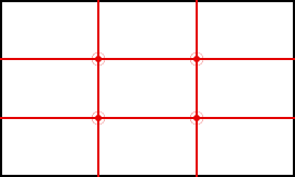
Imagine your image divided into a grid of 9 equal parts, similar to a tic tac toe grid.
Where these lines intersect are known as power points, or strong points of interest. Artists have been applying this rule for centuries.

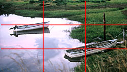
In the example to the right you can see how this grid divides the image into 9 parts using equally spaced horizontal and vertical lines.
Areas of your image that are placed on or near the intersecting points or along the lines of the grid become strong focal points.
A Sense of Balance
Following this rule is considered to make a composition more interesting and balanced. Something dead center might be balanced geometrically, but is usually boring. But when placed off-center it attracts more attention.
Good balance in composition is achieved in many ways.
A horizon line centered in the image would divide the picture in half. Placing the horizon line high in your frame focuses attention on the foreground, while a low horizon would place the emphasis on the sky.
A large object on one side of a composition might be balanced by allowing extra space on the opposite side. Light and dark areas are often used to balance one another.
A sense of balance is a feeling you get when viewing a picture. When a composition is not well balanced it can create a feeling of uneasiness in the viewer. Of course, if that is your intention then it can be quite effective.
Learn The Rules…Then Break Them
As with any rules or guidelines of composition, knowing the effects they produce can help you know when they should be applied. It can also help you decide when breaking the rule will better serve the message you want to communicate.

More Guidelines for Photo Composition


Well explained, the rule of thirds.